BLOG

Don’t say anything

Note: I found this draft post on my dashboard today. It’s from October 3, 2013. I finally decided to publish it.

As part of this project, I’ve been reviewing old video footage. My goal is to finally transcribe and properly document the materials that I have. Today, as I watched a group interview with some relatives from 2004 (I need to ask my dad to identify all of the wonderful women in this video), I was struck by a theme that came up more than once: the importance of remaining silent and not explicitly discussing what was going on. Several of the relatives suggested that it was part of the culture from the “old country” (Finland). You just knew that you weren’t supposed to say anything. One example involved Ines. One of the relatives used to visit the house and play with my Dad when they were kids. Every so often Ines would leave the room to go behind the curtain. She never said where she was going or why. She was taking care of Johanna who was bedridden and dying. But, she never said anything, because you didn’t talk about such things, you just did them.

This interview got me thinking about my own curiosity about Ines’ storytelling in her memoirs. So much is left out of her story. She mentions that her mother-in-law Johanna died in the early 60s, but she doesn’t describe how Johanna got sick or how long she was responsible for taking care of her. Could this be something that you didn’t talk about?
Cowbird Experiment

Here’s my first attempt at using Cowbird. Since I’m thinking of using it for this project, I thought I’d try it out. Pretty cool.

One note: For some reason, this embedded cowbird refuses to be responsive. With my limited css skills, I can’t figure out the problem. And my search efforts have been fruitless. Oh well, I’m sure Scott can figure it out for the final site.

I like Cowbird. I need to spend some more time on it trying to figure out how to connect with other “cowbirders.” I think this site might be a great place to work on preliminary drafts of my story fragments, especially the ones based on particular archival documents/items.

Storehouse

Storehouse is new storytelling app that launched just a few days ago. It enables you to create stories (with images, text, video) on your iPad using Flickr, Dropbox, Instagram and your iPhoto library. Pretty cool. As I was scrolling through the stories that are on the site already, I was inspired. In one story, A Case Against Umbrellas, Dan Bransfield shares his “glacial progress” on a short film that he’s been working on. Maybe I should try to document my process of working on The Farm using Storehouse? I think I’ll try it out next week.

Is this a trend?

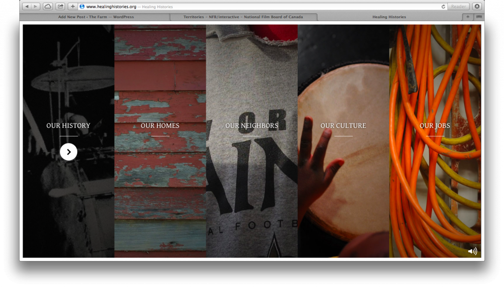
One of the key parts of The Farm is an interactive documentary. Inspired by the tradition within Finnish American culture (and amongst the Puotinen women) of weaving rag rugs on a loom, I’m calling the i-doc, “Banging on the Loom.”  I’m using the loom, with it’s warp and weft, as a model for structuring the stories (visually and conceptually). When I told Scott about my plan,  he immediately had an idea for the overall design of the pages: strips (like the weft on a loom) that expand when tapped or clicked. At first I wasn’t quite sure what he meant. Then, I watched/visited the interactive site, Healing HistoriesHere’s how they organize their stories:

Screen Shot 2014-01-16 at 5.40.45 PM

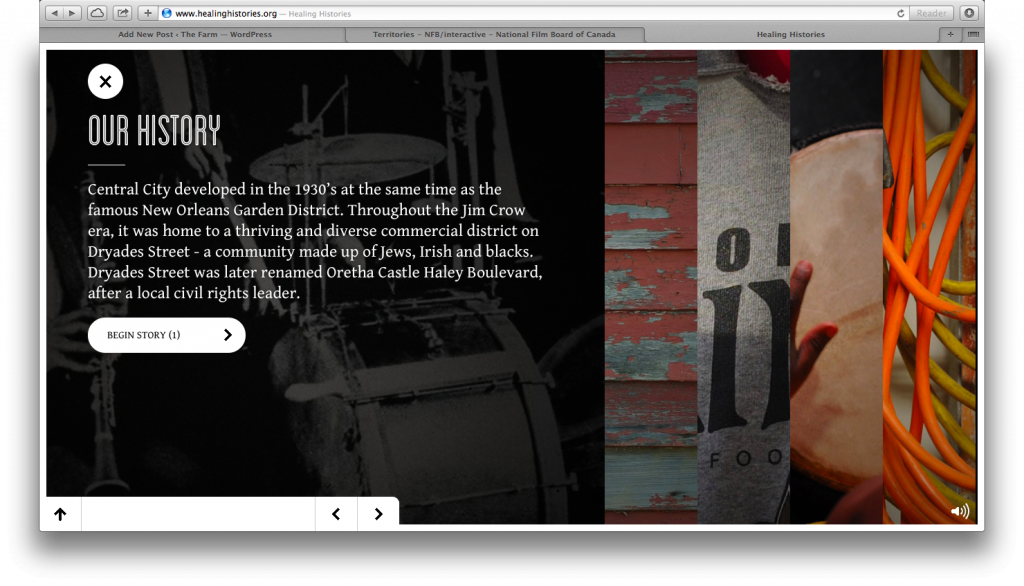
When you click on one the of the strips, it expands to provide more detail about the story and a link to “Begin Stories”:

Screen Shot 2014-01-16 at 5.43.41 PM

I think this approach is pretty cool and could be effective in mimicking the strips of cloth on a loom (if you make the strips horizontal instead of vertical, like the weft on a loom). I was planning to write about this site and its design sometime soon. Then, a few minutes ago, I came across another interactive story that uses a similar effect: Territories. Seeing this second site inspired me to write this post.

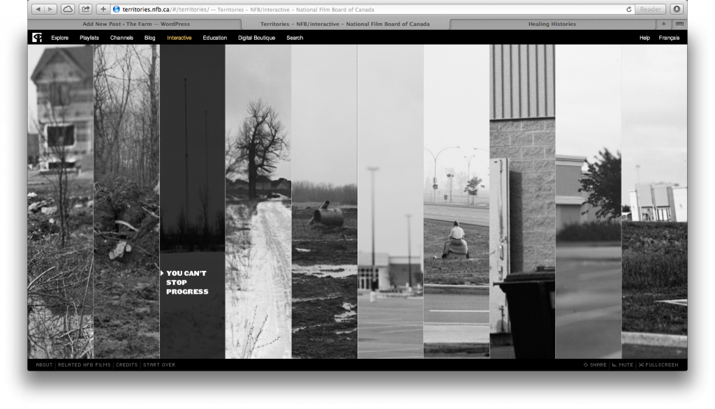
Here’s how the story topics are organized on Territories:

Screen Shot 2014-01-16 at 6.16.12 PM

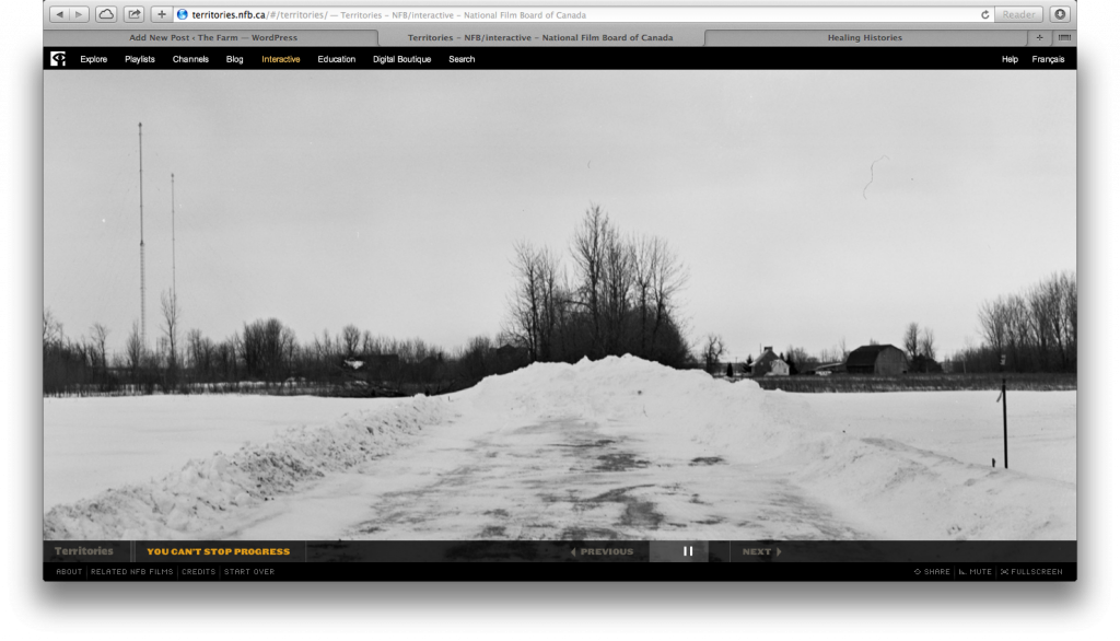
When you click on the topic, instead of expanding, like in Healing Histories, it opens up the story in a separate screen:

Screen Shot 2014-01-16 at 6.16.25 PM

I’m not sure which approach—expanding the story while still showing the other strips or moving to a separate screen with chosen story—I like better. After doing a little more exploring, I realized another key difference between the sites. While Healing Histories allows you to still see the “strips” screen when you click on the topic, once you click to “begin stories” you can’t see the strips again unless you click a reset button and start the entire experience (including the introduction) over. In contrast, after moving away from the “strips” screen to a separate story page on Territories, you can get back to the strips page at anytime by clicking on the “Territories” link at the bottom left. I like the idea of being able to return/refer back to the strips page at anytime. But I also like the idea of the strip expanding, but staying on the same page where the other strips are visible. Maybe we could combine elements from each of these designs?

Would that be too complicated? Speaking of complicated, in using the loom as a model, I’m creating stories on the weft (horizontal) and the warp (vertical). Is it possible to create a design that shows the horizontal strips and the vertical frame? Hmmm…

Additional Note:  After writing this post, I visited both sites on my iPad. Only Healing Histories works. Territories uses flash. I want my site to simultaneously work on all devices.

Interactive Maps

I’m really enjoying working on The Farm. Today, while figuring out my design/development schedule for the next year, I did a little bit of research on embedding google maps for a key section of my project. I had no idea that you could do so much with the maps! I’m looking forward to spending more time researching and thinking through this aspect of my project. Here’s where I’ll start my research: More Than a Map.