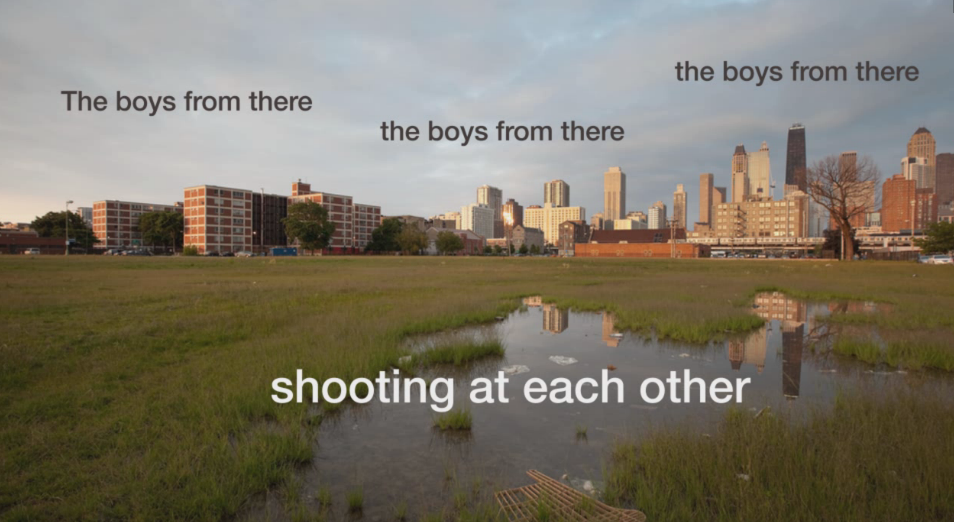
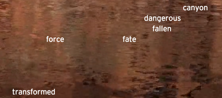
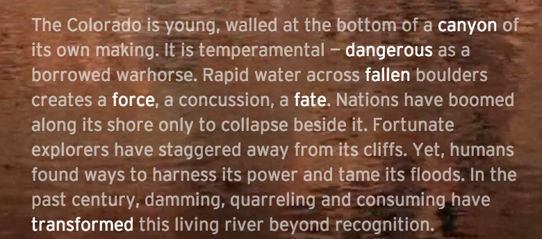
In the Chicago story, I like how the filmmaker uses text with images and voice-over. The words move around the screen and get bigger throughout the narration.
Month: November 2013
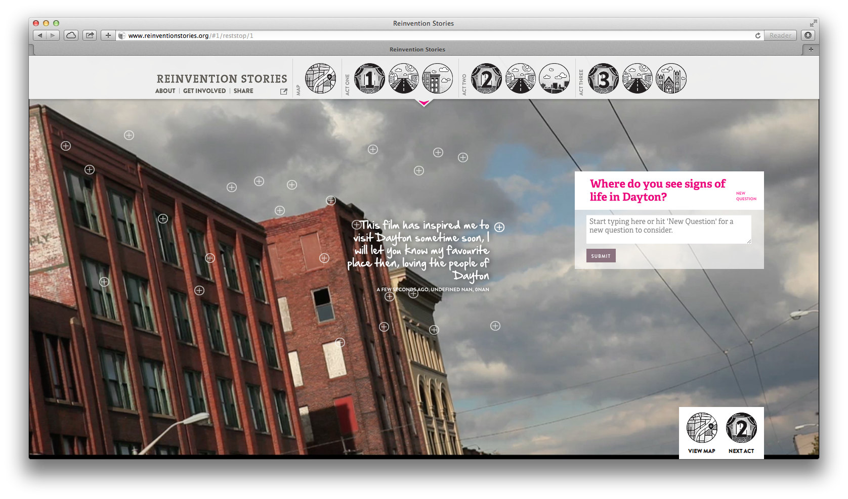
Interactive Idea: Reinvention Stories
I like the way that questions are posed to the user in Reinvention Stories and how answers appear on the screen. This could be useful in my question section:
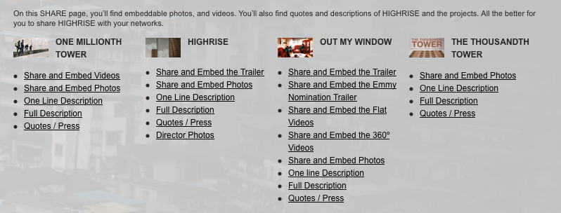
Sharing Resources
As I was scrolling through the “collaborative documentary experiment,” Highrise, I found this approach for making it easy to share materials about and from it. When I have some time, I’ll check it out and think through whether or not it’s useful for the searchable database I’m planning to include in my interactive story project.
Design Idea: Powering a Nation
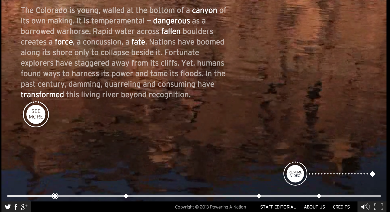
I wanted to make note of this cool design feature on the Powering a Nation site:
I like how they use the diamonds as chapter markers. While you can’t see it in the screen shot, when you scroll over the diamonds the chapter titles appear. When you click on them the movie (almost) immediately jumps to the next chapter. Cool.
I also like how the text gradually appears on the screen in this section. From this:
to this:
