On Remembering

I just finished reading (mostly skimming) Geoffrey Batchen’s Forget Me Not: Photography & Remembrance. Pretty cool. Here’s a passage at the end that got me thinking:

the act of remembering someone is surely also about the positioning of oneself, about the affirmation of one’s own place in time and space, about establishing oneself within a social and historical network of relationships (97).

Batchen

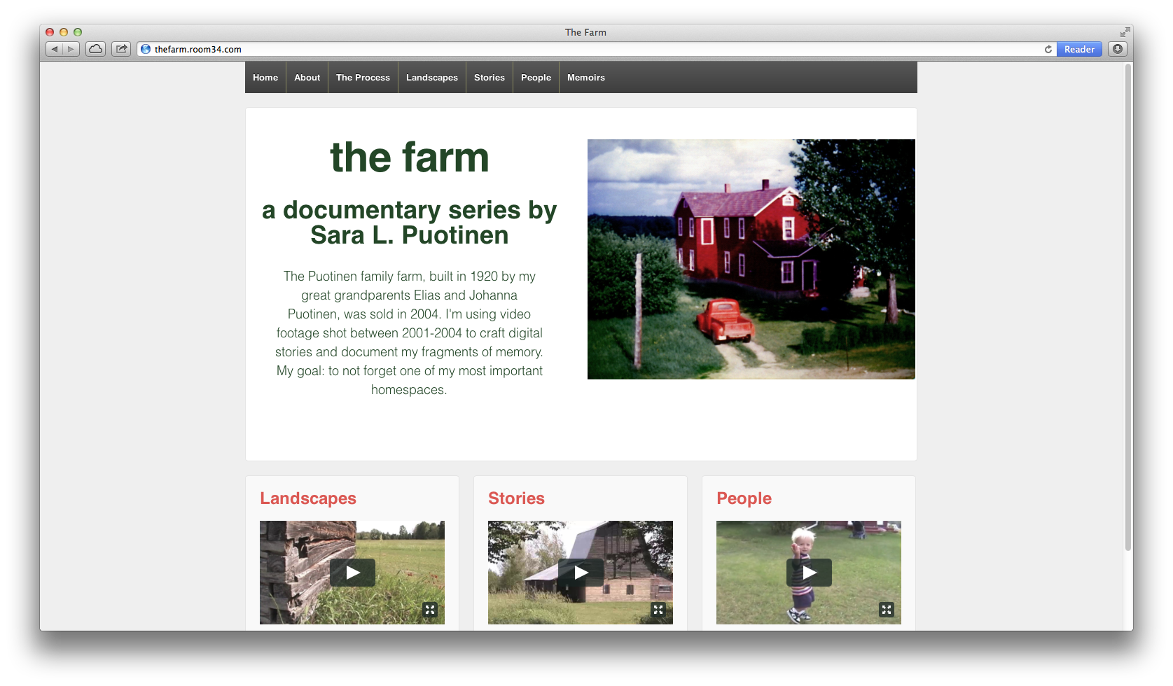
I am certainly motivated by a desire to make sense of my own relationships with generations of Puotinens as I work on this project. How do I fit in? What qualities of character do I share with other Puotinen family members? I’m also interested in rooting myself in a history. Most of the time I feel deeply disconnected from my past selves and past connections. I imagine this project as a way to connect with others and with the chain of selves that I have once been.

For further reading: Forget Me Not: An Interview with Geoffrey Batchen

Background Video

I’ve been thinking it would be cool to have video footage running in the background on my site. I’m looking for ways to make the user experience feel more involved so you’re not just viewing a video or reading text, you’re immersed in the landscape and the moods that are evoked by the buildings and people. Is background footage the best way to do that? Maybe. Maybe not.

I’ve found many different WordPress themes that allow for background video. Perhaps my favorite is Invictus, it’s responsive and looks pretty slick. But it is $45. I don’t mind spending the money, but I’m worried that I’d realize at some point during the project that I didn’t ultimately like it.  King Size looks nice too, provided you can (and I’m fairly confident that you can) remove the horse logo on the menu. But King Size is even more expensive at $50.

After some more research, I also found this cool (but expensive, at $75) theme: Full Frame.

Another approach to take is to find a free plugin. I found one on WordPress, mb.YTPlayer, but it requires YouTube videos and I’m on Vimeo. This morning, STA tweeted me a link to a site that was using background video effectively. After some quick investigating (I looked at the Page Source), I discovered that the site was using BigVideo JS. Pretty cool. It’s a free! JQuery plugin. I might have to try this one…even though it isn’t readily responsive.

On the BigVideo JS tutorial, which I haven’t read through yet, they discuss reasons for using or not using background video in a project:

Before we get started, give some thought as to whether using this technique at all is appropriate for your project. Background video is bandwidth heavy and can be a big drag on the user’s browser performance. If your site is already video-heavy or incorporating big video is essential to the design and purpose of your site, then using this technique may be a great choice. However, if you can accomplish the same goal with using cinemagraphs for example, maybe that is a better choice.

Cinemagraphs?! They are slightly animated images, that look like video, but aren’t. Cool. This might work too, especially if they use less band-width. I found a few resources for figuring how to make these, like this one, which shows you how to create one using Final Cut Pro X (which I got earlier this year).

Progress!

For the past few months, starting in May, I’ve been working on editing my Grandmother Ines’s memoirs and turning them into an interactive book. I originally submitted the book to iBooks at the end of June, but due to a few repeated editing errors (oops…I need to find an editor for my work), the book wasn’t published until yesterday. I know that’s a really quick turnaround for creating and publishing a book–only 3 months from beginning to end. I have a chapter in an edited (academic) book that took almost 2 years to be published. But, even though it was pretty quick, I was frustrated with waiting for it to be available. 

My editing fails have forced me to realize what I already know, but have been denying for too long: I need an editor who can review my work and provide me with critical and constructive feedback. I’m hopeful as I work to expand this project that I can connect with other writers/artists/storytellers/editors. Before doing that, I’d like to come up with a proposal and a more coherent outline for the project and my vision and goals.

An Overall Theme?

I’m currently trying to think through how to organize all of the material that I have for this project. What to include? What to leave out? What’s the most effective (engaging, compelling, intelligible) way to bring everything together? What should I use for the overall design?

To help me with these questions, I’ve been looking at other interactive documentary sites. Two that I particularly enjoy are Hollow and Reframing Mexico. I like Hollow because of the creative way it brings together digital stories with infographics, images and pull quotes by using a parallax design. It’s a beautiful, fun and immersive experience. But, I’m not sure if I really like parallax scrolling. It’s trendy and cool looking, but…. Is it too trendy? What sort of story/stories does it allow you to tell? Are those stories too linear? Is the way you engage with the information too directed (always compelled to move forward by scrolling down) by the design?

Hollow, which just went live last month, uses cool, “cutting-edge” techniques to provide information and tell stories that are compelling and that make you (almost) feel as if you’re in the West Virginia county. Reframing Mexico, which went live back in 2011, emphasizes easy, clear organization with themes, navigation bar buttons for quickly accessing all infographics and digital stories and for reading/viewing in English or Spanish. It lacks a little bit of the flair that Hollow has, but it’s beautiful too and I like how it allows the user to experience the stories and information in a number of different ways by clicking on the different links (themes, movies, infographics). It seems more accessible for a wide range of users (who speak different languages, are interested in different types of stories).

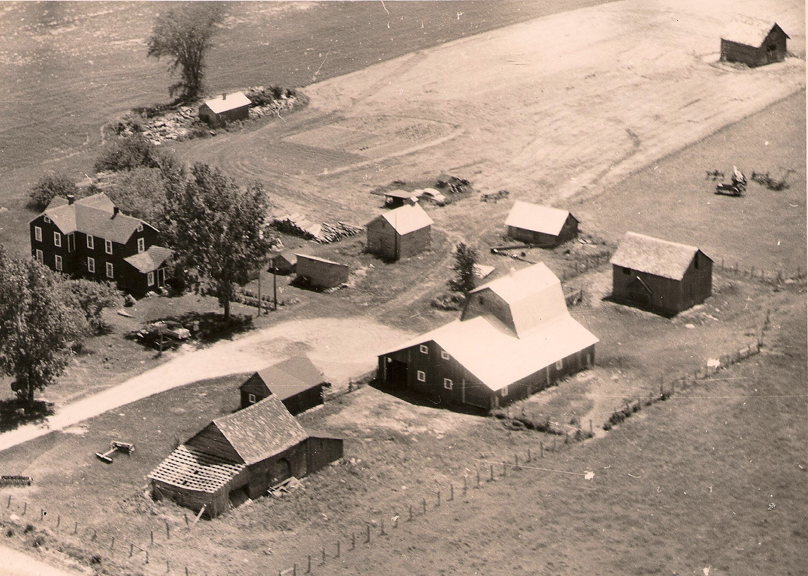
In thinking about my own approach to storytelling, I’d like to combine some of the elements from each of these sites: beautiful; effectively conveying moods/feelings; providing multiple ways to access and engage; displaying clear, yet compelling, organization. How? As a starting point, I’d like to focus the structure of the site (the information architecture) around this image of the farm from above:
farmfromabove

Perhaps this image/map of the farm could have clickable links to each of the buildings, and in-between the buildings, for stories, images, videos, archival material and more. Again, how? Time for some more research.

Responsive!

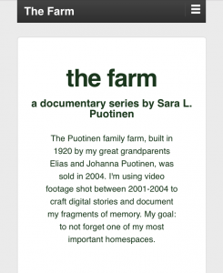
Partly inspired by Room 34 and all of the work STA has done on Responsive web design, I have decided to make my project responsive. What does that mean? Very simply put, a responsive website is a single site that works on many different devices, from smartphones to tablets to laptops. So, you don’t have to create a separate site for the phone and another for the laptop; the same content scales down (or up) to fit your device.

I like this approach, partly because STA has been proselytizing about responsive for a few years now, but mainly because I want folks to be able to engage with my stories on any number of devices and I don’t want to fiddle with making sure the content that I use isn’t too big or too small for a phone or with needing to create multiple sites (mobile and desktop).

As a user, I prefer responsive sites over non-responsive ones. It’s annoying to have to zoom in to read text or see an image and then keep moving the site around to read the rest of the content. On a responsive site, since the content is scaled to fit the device, you don’t have to fiddle with that. You just need to scroll down normally to read everything.

For my current site, I’m using a free, and very popular, WordPress theme: Responsive. I like that it’s free and that it has been (so far, at least) easy to customize it.

Mobile
Mobile
Desktop
Desktop

In my preliminary research on other interactive documentaries, I’ve been surprised to see that most (all?) of the sites that I’ve found are either not available for smartphones (Welcome to Pine Point and Hollow: The Film), or aren’t fully scaled to fit phones (Reframing Mexico and The Waiting Room). Why not? Is responsive too limiting in what it allows you do with stories? Are digital storytellers turning to apps for their interactive documentaries instead?

Pondering all of these questions has also got me thinking: are responsive sites (like my Responsive site) accessible for visually impaired viewers? If not, what can I do to make sure that my stories meet these accessibility requirements?

note: In checking this post out on the phone, I realized that the title “Responsive!” was not…responsive. I plan to go in and fix the font size for the mobile version right now.