Is this a trend?

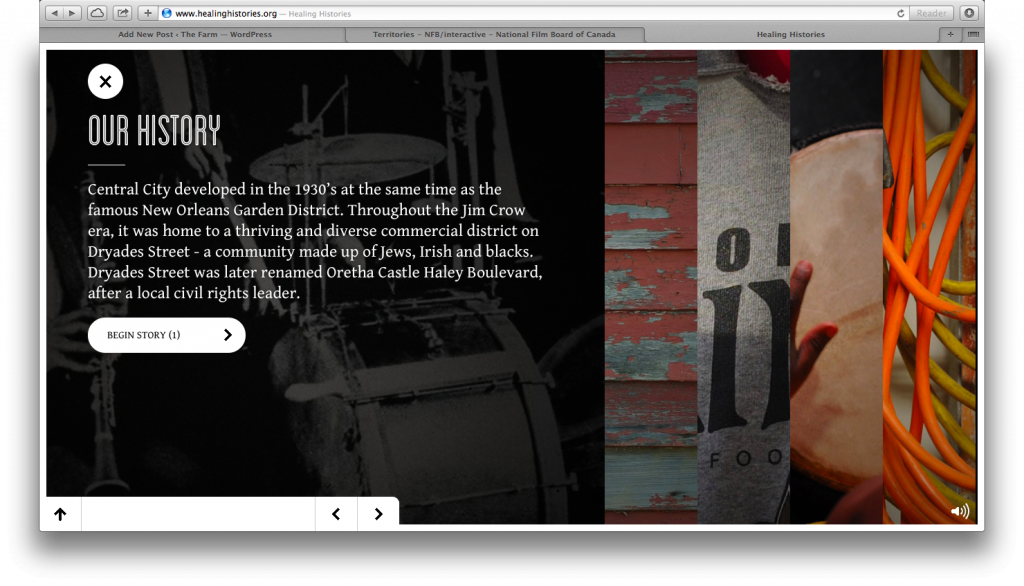
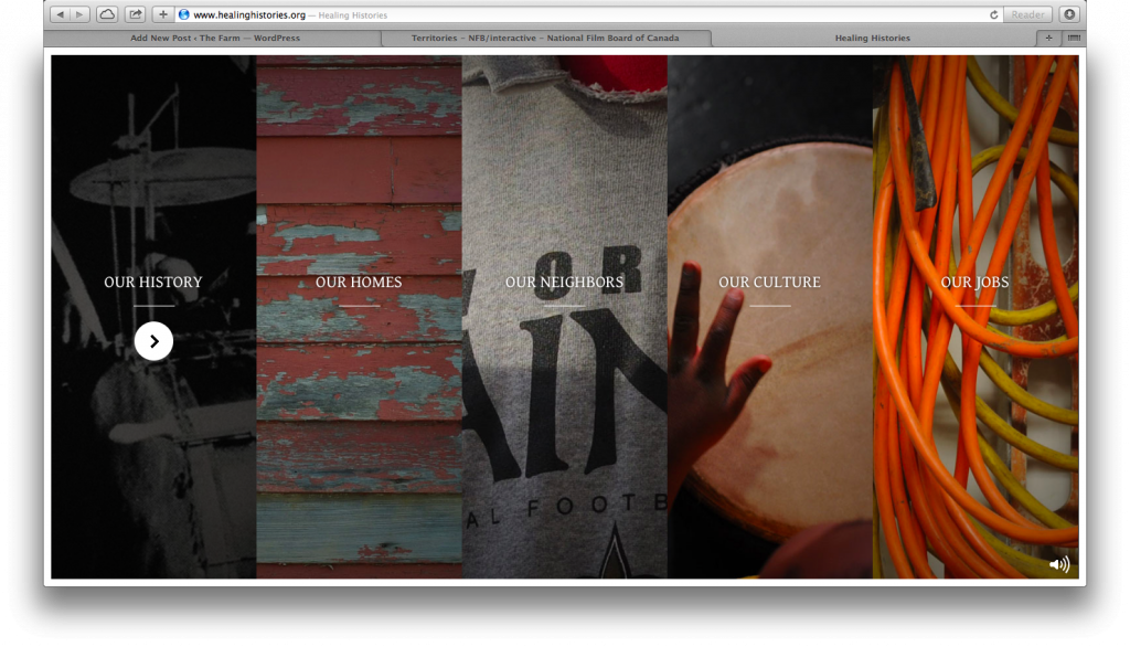
One of the key parts of The Farm is an interactive documentary. Inspired by the tradition within Finnish American culture (and amongst the Puotinen women) of weaving rag rugs on a loom, I’m calling the i-doc, “Banging on the Loom.”  I’m using the loom, with it’s warp and weft, as a model for structuring the stories (visually and conceptually). When I told Scott about my plan,  he immediately had an idea for the overall design of the pages: strips (like the weft on a loom) that expand when tapped or clicked. At first I wasn’t quite sure what he meant. Then, I watched/visited the interactive site, Healing HistoriesHere’s how they organize their stories:

Screen Shot 2014-01-16 at 5.40.45 PM

When you click on one the of the strips, it expands to provide more detail about the story and a link to “Begin Stories”:

Screen Shot 2014-01-16 at 5.43.41 PM

I think this approach is pretty cool and could be effective in mimicking the strips of cloth on a loom (if you make the strips horizontal instead of vertical, like the weft on a loom). I was planning to write about this site and its design sometime soon. Then, a few minutes ago, I came across another interactive story that uses a similar effect: Territories. Seeing this second site inspired me to write this post.

Here’s how the story topics are organized on Territories:
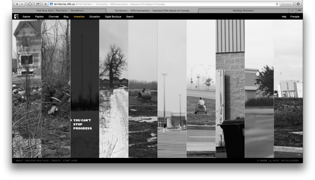
Screen Shot 2014-01-16 at 6.16.12 PM

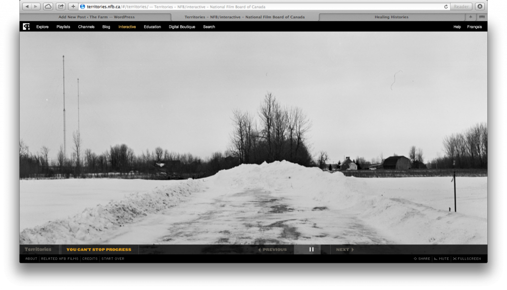
When you click on the topic, instead of expanding, like in Healing Histories, it opens up the story in a separate screen:

Screen Shot 2014-01-16 at 6.16.25 PM

I’m not sure which approach—expanding the story while still showing the other strips or moving to a separate screen with chosen story—I like better. After doing a little more exploring, I realized another key difference between the sites. While Healing Histories allows you to still see the “strips” screen when you click on the topic, once you click to “begin stories” you can’t see the strips again unless you click a reset button and start the entire experience (including the introduction) over. In contrast, after moving away from the “strips” screen to a separate story page on Territories, you can get back to the strips page at anytime by clicking on the “Territories” link at the bottom left. I like the idea of being able to return/refer back to the strips page at anytime. But I also like the idea of the strip expanding, but staying on the same page where the other strips are visible. Maybe we could combine elements from each of these designs?

Would that be too complicated? Speaking of complicated, in using the loom as a model, I’m creating stories on the weft (horizontal) and the warp (vertical). Is it possible to create a design that shows the horizontal strips and the vertical frame? Hmmm…

Additional Note:  After writing this post, I visited both sites on my iPad. Only Healing Histories works. Territories uses flash. I want my site to simultaneously work on all devices.
Interactive Maps

I’m really enjoying working on The Farm. Today, while figuring out my design/development schedule for the next year, I did a little bit of research on embedding google maps for a key section of my project. I had no idea that you could do so much with the maps! I’m looking forward to spending more time researching and thinking through this aspect of my project. Here’s where I’ll start my research: More Than a Map.

Background Sounds

I really like the combination of sounds that plays in the background of Similkameen Crossroads. It’s a mix of organ music with footsteps, moving through the grass and into the church. For The Farm project, I’d like Room 34’s soundscapes to combine found sounds (walking through the tall grass?, wind in the trees?, barn doors opening, a rag rug loom banging, birds chirping) with composed fragments of songs.

How to Navigate

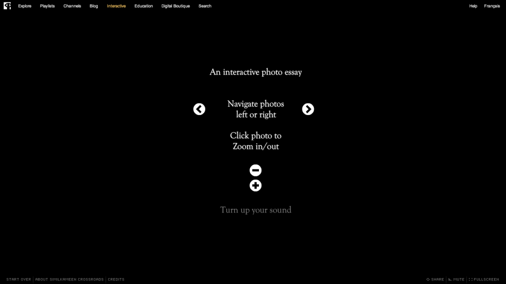
I love watching other interactive projects for inspiration. This morning I’m watching a beautiful interactive photo essay, Similkameen Crossroads. It’s on the National Film Board of Canada Site. At the very beginning of the essay, right after it loads, text pops up on the black screen, describing to the user how to navigate the story/site.

Screen Shot 2014-01-13 at 7.30.50 AM

This opening screen makes me think about my own project and the ways I could alert users to how to navigate the stories/site. I like the idea of Crossroads simple visual explanations, but the text does move really quickly. It’s difficult for users (myself included) to read/absorb the three ways you can navigate the site. What if you had a link to this page somewhere on the site so that people could spend their time thinking through how the site works?

Roomination

With the help of Scott (Room 34), I’ve decided to tentatively call the farm “rooms” Roominations. The name came about when I was recounting to Scott one of my favorite quotations by Judith Butler and how it fits with one goal for the rooms:

But here I would ask for your patience since it turns out that critique is a practice that requires a certain amount of patience in the same way that reading, according to Nietzsche, required that we act a bit more like cows than humans and learn the art of slow rumination (307).

Yes! Being at the farm, where time was much slower (my best friend Jenny named it, “the place where time stands still”), encouraged me to be patient and inspired me to want to stop and think about…everything. I deeply miss that space; I haven’t been able to find any other location that encourages as much reflection as the farm did. The farm rooms/roominations are my attempt to (re)create spaces that encourage this deep and slow thinking.

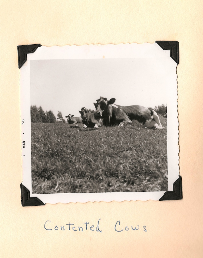
Contented cows on the farm.

Even though it might be a little cheesy, I like calling these rooms “roominations.” Unlike the term rumination, which focuses on the act of ruminating, roomination also focuses on where that act take place (it’s not just an act; it’s a process located in a specific place). I also like calling these roominations because the farm was, for many years, a dairy farm. My dad has fond memories of milking and bonding with the cows. It seems fitting to reference that past.