A key part of this project is the creation of a series of farm “rooms.” These rooms combine soundscapes (looped tracks + found sounds), images, video footage, text and voice-over to create immersive spaces that enable you to feel like you are at the farm. But, what does it mean to “feel” like you’re at the farm? For me, being at the farm always made be feel inspired by the landscapes and the buildings to pause and reflect on my life. It allowed me to get away and achieve some critical distance from the entrenched habits of my daily life. But the farm didn’t feel like an escape from the “real” world, but a homecoming to the place (the spirit, the people) that nurtured and supported me, allowing me to “be who I was and enjoy who I was.” Currently, I’m working on two “rooms” that focus on the feelings of getting away and being nurtured. Here’s a (very) preliminary video mock-up of what those rooms will look/feel like:
Category: Design
The posts in this category include discussions of the design of the interactive story, including: sound, site design, user experience (UX), navigation and visual layout.
Site Redesign
While I haven’t been posting as much on this blog lately, I’ve been working hard on planning my project. Hopefully soon I can actually start building it. For now, I’m in the process of tweaking my site, both content and design. I envision this site as the placeholder for a more elaborate site, designed with the help of Room 34, so I’m trying to keep it pretty basic.
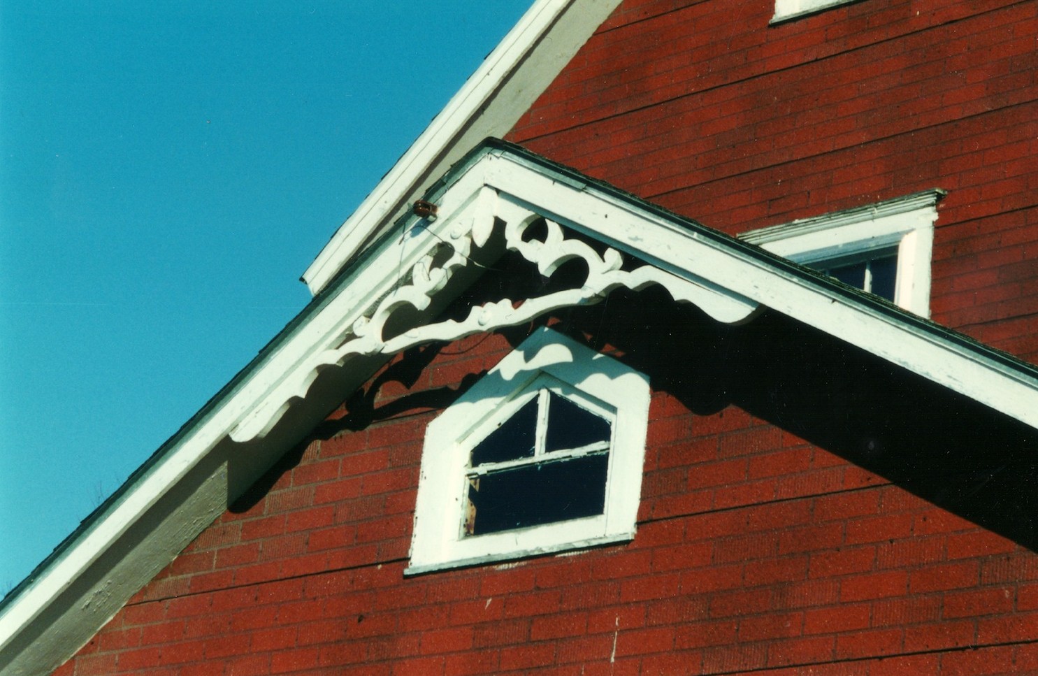
Yesterday I decided to add a background image. Why? Partly because I just figured out that you could do that and it seemed much more interesting than the bland blue that I had been using. Initially I wanted to use a close-up on the weathered boards of the barn or the grain shed, but I really liked this photo my mom took of the farm house:
I must admit, I always found the fake red siding that my grandparents put on the farmhouse to be pretty ugly. But looking at it now, it conjures up strong feelings of being at the farm. I love the contrast between the red siding, the white trim and the bright blue sky. The blue is so intense that I can almost smell the fresh air. I miss that air.
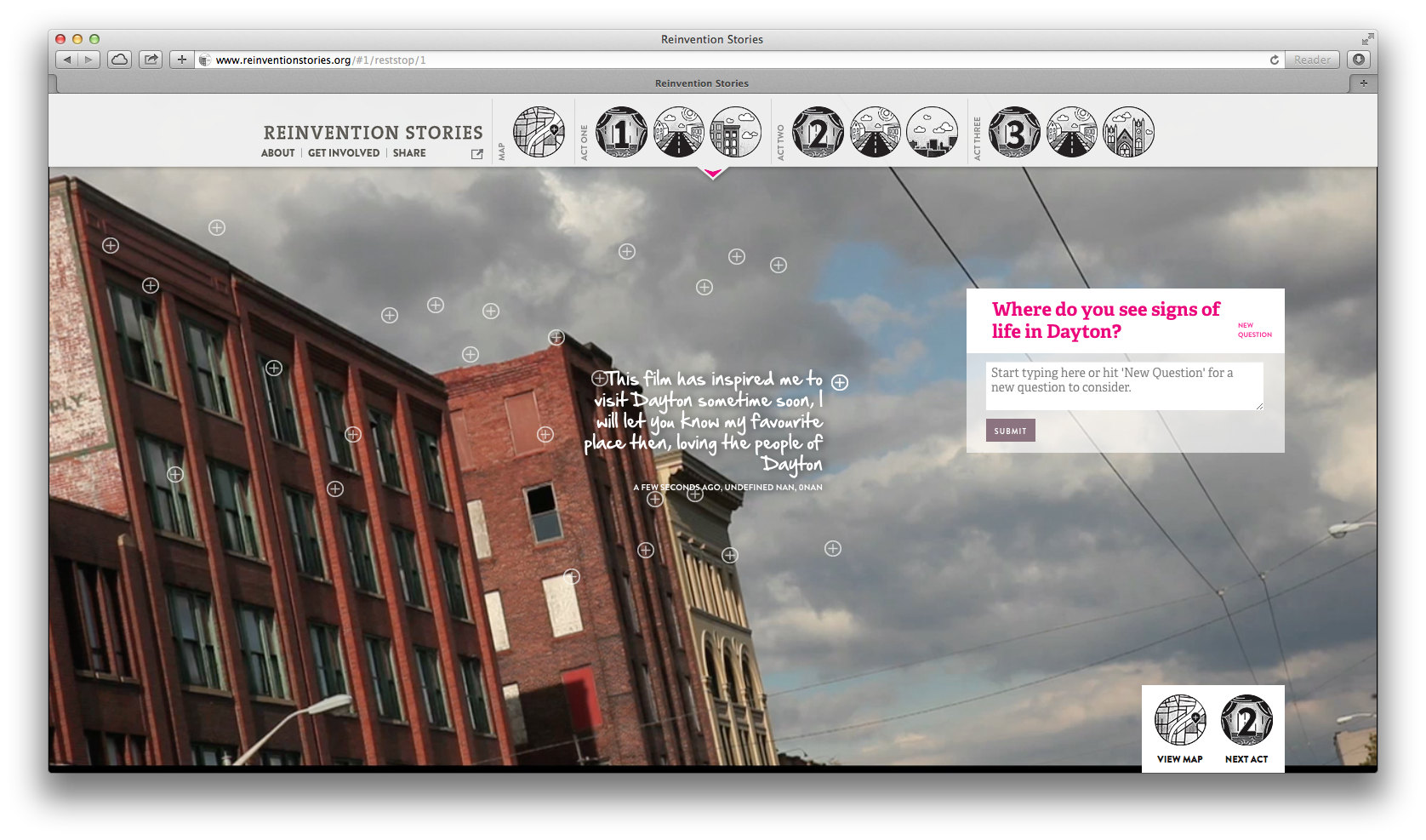
Interactive Idea: Reinvention Stories
I like the way that questions are posed to the user in Reinvention Stories and how answers appear on the screen. This could be useful in my question section:
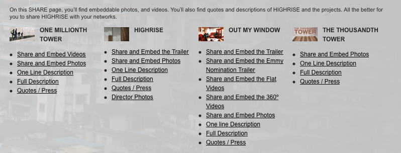
Sharing Resources
As I was scrolling through the “collaborative documentary experiment,” Highrise, I found this approach for making it easy to share materials about and from it. When I have some time, I’ll check it out and think through whether or not it’s useful for the searchable database I’m planning to include in my interactive story project.
Design Idea: Powering a Nation
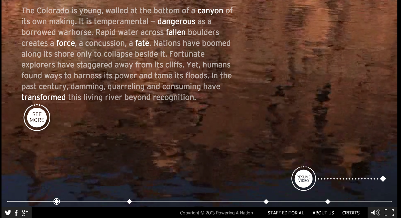
I wanted to make note of this cool design feature on the Powering a Nation site:
I like how they use the diamonds as chapter markers. While you can’t see it in the screen shot, when you scroll over the diamonds the chapter titles appear. When you click on them the movie (almost) immediately jumps to the next chapter. Cool.
I also like how the text gradually appears on the screen in this section. From this:
to this:
