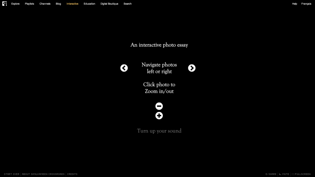
I love watching other interactive projects for inspiration. This morning I’m watching a beautiful interactive photo essay, Similkameen Crossroads. It’s on the National Film Board of Canada Site. At the very beginning of the essay, right after it loads, text pops up on the black screen, describing to the user how to navigate the story/site.
This opening screen makes me think about my own project and the ways I could alert users to how to navigate the stories/site. I like the idea of Crossroads simple visual explanations, but the text does move really quickly. It’s difficult for users (myself included) to read/absorb the three ways you can navigate the site. What if you had a link to this page somewhere on the site so that people could spend their time thinking through how the site works?
