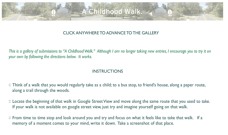
I love this project from Ze Frank. I’ve already linked to it, but I decided to take a screen shot of their description of the project here. Once you click in/through the project, you can’t access the project description again.
Category: Resources
Immersion
This morning, I’m checking out an amazing interactive site about the history of documentaries and technology. The first section is about Immersion. I wanted to make note of this passage:
The word ‘medium’ has many meanings in English, most going back to classical Latin. But by an odd chance, two ‘new’ meanings first appeared around 1851: medium as a channel for mass communications (‘the photographic medium’) and medium as an intermediary between the living and the dead (‘the medium organized a séance’). One transmits information from point ‘a’ to point ‘b’, and the other ‘makes present’ that which is impossibly distant. The immersive urge that has accompanied our media from the very start seems to embrace both definitions, to tell us about another place and to make that place as present as possible.
I’m struck by the line, “as present as possible.” A key part of my project is to craft a space that replicates the feeling of being at the farm. As much as I want people to “feel” like they’re farm, I know that that farm feeling is only always a replication, an approximation. Is there a way to make that acknowledgment visible in the project?
I’m also struck by the line, “make present that which is impossibly distant.” The farm is impossibly distant. Now that it has been sold and I can’t visit it every summer, it is forever “there,” when it used to be “here.” The only way I can repeatedly access it is through old photographs, stories/interviews and video footage from the early 2000s.
Wow. I want to think about this passage some more and find ways to incorporate it into my project.
Unremember?
I just finished Wendy McClure’s really entertaining book, The Wilder Life. It chronicles the author’s attempts to access and inhabit Laura (as in Laura Ingalls Wilder) World, the world that Laura Ingalls Wilder and her daughter Rose crafted in the Little House books. She includes stories about the books and the television series, traces (and troubles) the relationship between truth and fiction in Laura’s accounts, details her own adventures (and the unique individuals she encounters) visiting the various Laura historic sites sprinkled throughout the midwest and critically explores her own investments in trying to become part of Laura World.
While there are many different reasons I enjoyed this book, perhaps the biggest were: 1. McClure’s efforts to reflect on her own investments in the project (especially as those investments connected to the recent death of her mom from cancer) and 2. her willingness to push beyond searching for the Truth (what really happened) to explore the space in between fact and fiction, where we can craft stories that should have happened or that we wished had happened or that did happen, but not quite in the ways that we imagine/remember.
Towards the beginning of the book, McClure spends time researching the history of the actual Laura, scouring old records, scholarly books and popular biographies, trying to determine what events in the LHOP (Little House on the Prairie) books are real and which are imagined. But, at certain point, she realizes that this determination isn’t necessary. She writes:
I knew what was real…and what wasn’t…and there was a lot of stuff in between that I wasn’t quite sure about….But maybe those distinctions ultimately didn’t matter as long as I recognized them; maybe I didn’t need to sort truth from fiction from exaggeration in order to go further into Laura World (48).
McClure
This passage makes me think about the Puotinen farm and my own relationship to it as a real and imagined place, the Farm World. I could spend a lot of time reflecting on my own understandings of truth/fiction and real/imagined at the farm. For me, the distinctions do matter, but not in way that privileges one over the other. I keep thinking about the “stuff in between” and the possibilities it might offer for new understandings of what’s real and what’s imagined.
McClure closes the book with a chapter entitled, “Unremembered.” I’m intrigued by the concept, even as I can’t quite understand what she’s trying to say with it. Here’s how she describes unremembering:
Maybe the Little House books have always been a way to unremember–a word that I kept coming back to…I know technically it means to forget but somehow, in my mind the definition changed. To me unremembering is knowing that something once happened or existed by remembering the things around it or by putting something else in its place. Laura Ingalls Wilder unremembered being hungry by writing Farmer Boy, and Rose Wilder Lane unremembered her terrible childhood by helping her mother write about hers….You don’t deny something when you unremember it, you just give it a place to live (324).
I wonder, how does/doesn’t this idea of unremembering connect with my understandings of not forgetting and remembering?
Follow-up note: I just found an interview with McClure in which she briefly discusses “unremembering.” She suggests that it involves “making a place for something, even if it’s too difficult to remember it directly.” As I write this, I’m still not sure I understand what she means.
The Importance of UX
Before I started working with Room 34 and learning (just) a bit about web development, I didn’t know the term UX. It stands for user experience and it’s a central part of the development process for folks who make websites. Here’s how Scott Anderson describes UX on the Room 34 site:
The UX designer uses the defined functional and content requirements for the site to develop a set of wireframe designs and flowcharts describing how users will interact with the site.
Room 34
I was immediately drawn to the idea of taking seriously the user and their experiences of engaging/not engaging with a site; I see many affinities between it and some strains of feminist pedagogy that emphasize de-centering the Teacher and empowering learners to claim their own education. When I was a professor, I taught, researched and wrote about feminist pedagogy a lot. In fact, for several years, I’ve wanted to spend more time thinking through and writing about how feminist pedagogical theories could (and should) be applied to online technologies, especially UX design. At this point, I can’t quite articulate how feminist pedagogical theories and practices influence my design and development of The Farm, but I know that they are a big influence on how I’m envisioning this project. Sometime soon, I’d like to revisit my old syllabi + notes + articles + blog posts in order to develop a statement about feminist pedagogy, UX, online technologies and interactive documentaries.
This morning, while looking at the i-Doc site, I was reminded of my interest in UX design when I saw a blog post about a new series: The UX Series (which originates here, on Sandra Gaudenzi’s site). Pretty cool. I really like the question she asks in her introduction: Where is the user in the interactive documentary? According to Gaudenzi, while the user is considered in interactive documentaries, that consideration typically doesn’t happen until the end of the process. Instead, the Story remains the focus. In a video chat about UX, Ingrid Kopp suggests that one reason for this privileging of the Story over UX is because most i-doc projects are created by filmmakers who have little experience with web development (or UX strategies). She argues that these filmmakers are just starting to learn how to incorporate UX strategies into their design.
I’m excited to follow this series. With my growing interest in bringing UX into conversation with storytelling and feminist pedagogy, I look forward to reading, watching and listening to how experienced i-doc creators/producers explore questions about the user. In The Farm, I’m thinking a lot about the various ways the user can/will interact with my stories and the virtual space of the farm, but I haven’t always had the language for articulating those thoughts. I’m hopeful that the topics discussed in this series will help me to articulate my own UX vision.
An interesting point came up in Paula Zuccotti’s video response to the first (of seven planned) question, What would it mean to apply design thinking to the creation of i-docs? She encourages i-doc creators to consider how individuals vs. groups interact with an online story. Are i-Docs designed for one user to engage alone? How do i-doc creators account for the potentially conflicting interests of users who are watching together?
How to Navigate
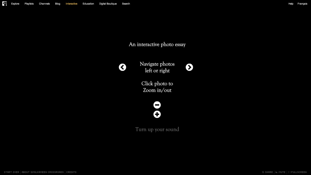
I love watching other interactive projects for inspiration. This morning I’m watching a beautiful interactive photo essay, Similkameen Crossroads. It’s on the National Film Board of Canada Site. At the very beginning of the essay, right after it loads, text pops up on the black screen, describing to the user how to navigate the story/site.
This opening screen makes me think about my own project and the ways I could alert users to how to navigate the stories/site. I like the idea of Crossroads simple visual explanations, but the text does move really quickly. It’s difficult for users (myself included) to read/absorb the three ways you can navigate the site. What if you had a link to this page somewhere on the site so that people could spend their time thinking through how the site works?

