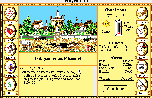
I’ve decided to include a video game as part of this project. I recently received a micro grant to work on the game with my 10 year old son. Pretty cool. I envision this video game as a way to tell the story of the history of coming from the old country (Evijärvi) to the new country (UP Michigan). A key inspiration for this project is Oregon Trail. While I don’t recall playing the game in elementary school (I don’t remember using computers that much in the 1980s), I am familiar with it and the basic structure. Plus, I just played a bit of it. Here’s a screen shot from the “old-school” Mac version:
Category: Forms and Formats
Childhood Walk
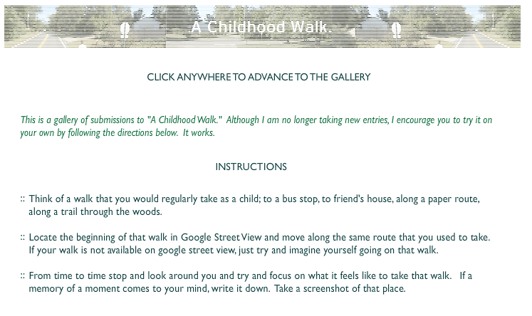
I love this project from Ze Frank. I’ve already linked to it, but I decided to take a screen shot of their description of the project here. Once you click in/through the project, you can’t access the project description again.
An App?
I’m not sure whether or not I want to develop an app for this project. Are they the best way to tell and share stories? To get people engaged with the project? I’m not convinced that an app is needed. While browsing through the Cowbird FAQ the other day, I came across their answer to the question: Do you have an app?
No. We think Apps are destined for obsolescence — they’ll be the CD-Roms of tomorrow. We believe in the open Web. That said, you’ll find that Cowbird works well on your smartphone.
Cowbird
I like this answer. And, I like how the site works on my phone. In a post a week ago I mentioned how my embedded story wasn’t responsive. It kept getting cut off on the phone. Not sure if that’s a problem with Cowbird or with my theme? For now, I’m not sure it matters; I like the idea of directing people to Cowbird.
The Importance of UX
Before I started working with Room 34 and learning (just) a bit about web development, I didn’t know the term UX. It stands for user experience and it’s a central part of the development process for folks who make websites. Here’s how Scott Anderson describes UX on the Room 34 site:
The UX designer uses the defined functional and content requirements for the site to develop a set of wireframe designs and flowcharts describing how users will interact with the site.
Room 34
I was immediately drawn to the idea of taking seriously the user and their experiences of engaging/not engaging with a site; I see many affinities between it and some strains of feminist pedagogy that emphasize de-centering the Teacher and empowering learners to claim their own education. When I was a professor, I taught, researched and wrote about feminist pedagogy a lot. In fact, for several years, I’ve wanted to spend more time thinking through and writing about how feminist pedagogical theories could (and should) be applied to online technologies, especially UX design. At this point, I can’t quite articulate how feminist pedagogical theories and practices influence my design and development of The Farm, but I know that they are a big influence on how I’m envisioning this project. Sometime soon, I’d like to revisit my old syllabi + notes + articles + blog posts in order to develop a statement about feminist pedagogy, UX, online technologies and interactive documentaries.
This morning, while looking at the i-Doc site, I was reminded of my interest in UX design when I saw a blog post about a new series: The UX Series (which originates here, on Sandra Gaudenzi’s site). Pretty cool. I really like the question she asks in her introduction: Where is the user in the interactive documentary? According to Gaudenzi, while the user is considered in interactive documentaries, that consideration typically doesn’t happen until the end of the process. Instead, the Story remains the focus. In a video chat about UX, Ingrid Kopp suggests that one reason for this privileging of the Story over UX is because most i-doc projects are created by filmmakers who have little experience with web development (or UX strategies). She argues that these filmmakers are just starting to learn how to incorporate UX strategies into their design.
I’m excited to follow this series. With my growing interest in bringing UX into conversation with storytelling and feminist pedagogy, I look forward to reading, watching and listening to how experienced i-doc creators/producers explore questions about the user. In The Farm, I’m thinking a lot about the various ways the user can/will interact with my stories and the virtual space of the farm, but I haven’t always had the language for articulating those thoughts. I’m hopeful that the topics discussed in this series will help me to articulate my own UX vision.
An interesting point came up in Paula Zuccotti’s video response to the first (of seven planned) question, What would it mean to apply design thinking to the creation of i-docs? She encourages i-doc creators to consider how individuals vs. groups interact with an online story. Are i-Docs designed for one user to engage alone? How do i-doc creators account for the potentially conflicting interests of users who are watching together?
A Map
I’m really glad that I spent so much time analyzing Welcome to Pine Point last week. It gave me a lot of good ideas for what I do and don’t want to do in my interactive documentary. One thing that bothered me about Pine Point was how much the story and our understanding of Pine Point (the town, the people in it) were centered on the perspectives of the narrator (one of the creators, Mike Simons). While he interviewed several Pine Pointers and offered up some facts about the town and how it was erased, the overall story seemed to focus on his own nostalgia for the/a past and his romanticizing reverence for Pine Point as the town that never changed.
I’m particularly sensitive to nostalgia, reverence and romanticizing because I worry about it with my own stories about the farm. In fact, finding a way to honor my heritage and recount the stories without romanticizing them is one of my goals. Throughout Welcome to Pine Point, the narrator recognizes the tendency to romanticize, but he doesn’t ever seem to challenge it or work to correct it in his own accounts.
In Welcome to Pine Point, the town seems unreal: a figment of fantasy that only exists as a memory or legend. But, the town actually did exist. And it was located on a map. Why didn’t the Googles (who created this doc) include a page with a map? I think a map would enable a user, especially one who isn’t that familiar with the Northwest Territory, to see Pine Point as a real place in a specific location (instead of standing in as the legendary town-that-never-changed). I imagine that the lack of map was deliberate; it contributed to the haunting effect of the story and to the appeal of Pine Point as a place like no other.
I want to include a map of Amasa and the farm in my interactive documentary. Even as my stories about the farm will be (somewhat) romantic and vague (lacking many details and dates), I’m not interested in presenting the farm as a mythical place. It did (and still does) exist in a fixed location.
I asked STA about having a map. He said that google maps is highly customizable (if you know javascript, which I don’t….yet). I hope to look into that soon.

