In this analysis, I’m looking at the recent (it went live just a few months ago) interactive documentary, Hollow. Here’s a description of the project from the Kickstarter page (they raised over $28,000 for production and completion):
Hollow is an interactive documentary and community participatory project that focuses on the lives of residents in McDowell County, West Virginia. Hollow combines personal portraits, interactive data, participatory mapping and user-generated content on an HTML5 website designed to address the issues stemming from stereotyping and population loss in rural America. Community members will take part in the filmmaking process by creating their own documentary portraits and balloon maps. Hollow strives to bring attention to issues in rural America, encourage trust among the community and become a place where users can share ideas for the future.
note: While many of the other interactive documentaries that I’ve looked at or reviewed offer an about page directly on the site, I couldn’t find one here. Did I just miss it?
Design Elements
- desktop only, not accessible on tablet or phone…trying to raise money to create app
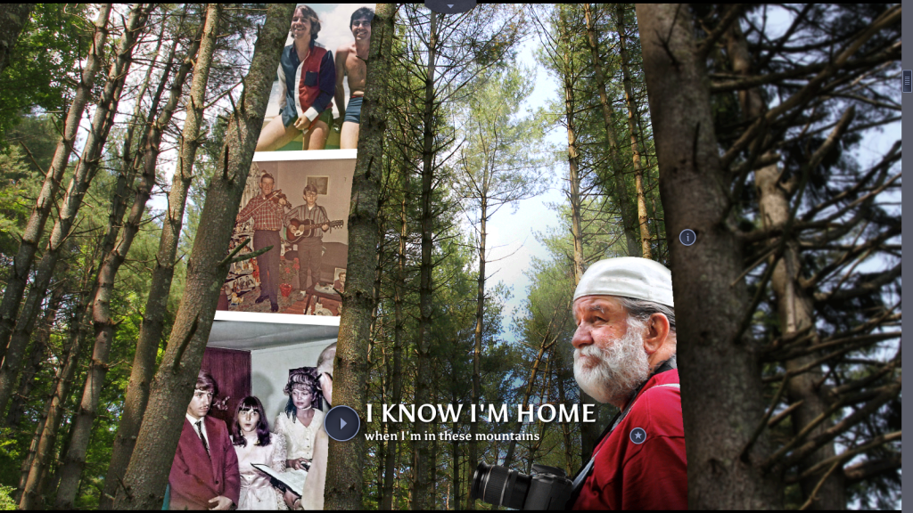
- lots of parallax scrolling in different directions: side to side and up and down with cut-out images, occasional animation, lush backgrounds + sound scrolls too
- beautiful images and video of West Virginia (image-heavy)
- text used in brief quotations or headlines, not many lengthly descriptions on screen (unless you click on info buttons)
- creative collages
- navigation bar at bottom of screen, can click on different chapters at any time
- pages must load
- icons on screen: i for information + triangle for video + star for bonus material (which can be unlocked once you watch the videos)
- continuous sound (background noises + music), automatically loads, but can be muted
- tons of content in each section, only available when scrolling through site, no resource page. (I’m noticing a real effort to create and control the user experience. Did the filmmaker choose to not have a resources page because they wanted the user to experience the interactive documentary the way they wanted them to? This seems to be a frequent desire from filmmakers).
QUESTION: How much can/should the creator control the user experience? How much freedom should the creator give to the user? When does freedom create too much confusion and chaos?
Content
- bunch (how many? not sure) short, 2-3 minute video portraits/interviews of residents
- footage from various residents (parents getting footage of baby, at the swimming pool, parade, riding on an ATV trail)
- quotations from interview are featured on screen, when scrolling after watching films
- infographics with statistics about area and its residents
- sharing stories of love for community, desire to fix it
Sections:
- The way it was: really cool scrolling infographic detailing history of rise and fall of county.
- These roots: on love of place, sense of connection, home
- For each other: community, coming together in crisis (flood of 2012), community projects, sports (football, swimming)
- For the land: drug culture, tourism, fishing/trout, housing/construction, creating new businesses
- When coal was king: history of county when prosperous through photos and videos (cool technique of focusing in on old photo of person and then fading into a current photo of them (which leads to video interview), October Sky festival, mining/mine-related illness/impact of mining
- Around the bend: the future, hope
Responsive
No.
Storytelling
- linear in terms of sections, starting with the past (section 1) and ending with the future (final section)
- centered around characters more than actions
- created to evoke a mood and sense of respect for the specific place
- mostly through images, sounds and video
- reminds me of Ursula K. Le Guin’s idea of story as house
Interactivity
- scrolling through at own pace, can click on tons of different icons for information + videos + bonus material
- throughout doc there are opportunities to contribute content: tag pictures of home on hollow’s instagram page, answer survey questions
Strengths
- beautiful
- very effective in immersing user in story, enabling them to feel and experience the county
- creative displays of infographics
- cool use of parallax, creating collages of image, video, sound
Weaknesses
- too much parallax, it gets really annoying and tiring
- must wait at every chapter for it to load. This can get annoying if you’re trying to go back and forth between chapters.
- experience is too controlled by structure of site and filmmaker. While there are opportunities for interacting, they are heavily shaped by how filmmaker wants you to experience the documentary
- not responsive
- no resource page or way to access all of the information (videos, images, information) unless you tediously scroll through each chapter. Sure, this creates a “cool” mood and a powerfully immersive experience, but users may want to access the information again and in different ways.
Things to Use?
- the quotations, pulled out of the interviews and featured on their own page
- icons for type of content (information, video, bonus material. maybe?
- soundscapes? Not sure. Can be too intrusive, but I like the idea of background sounds to help evoke a mood.
Summary
This is a really cool interactive documentary, that is visually stunning and that offers a lot of great content. I’m bothered by the parallax scrolling and the efforts of the filmmaker to control the user’s experience. Is this the only way to create a mood and to immerse the user in the documentary, forcing them to scroll through and only giving them access to the material in one way? I hope not. I’d like to create a site that provides the user with more freedom and more access to the information in many different ways, but that doesn’t allow that freedom to confuse or over-complicate the stories.
