BLOG

Telling a story

In various discussions about their interactive documentary, Welcome to Pine Point, the Goggles (creative team of Michael Simons and Paul Shoebridge) emphasize the importance of linear (as in, beginning, middle, end) storytelling. In an interview with Nieman Storyboard they argue:

The thing for us that we’re happiest with is that we stuck to what linear “narrative” has done for so long: that beginning, middle and end. Because we stuck with that, that’s the thing that worked the best for us. People want to be told stories, they want to be engaged.

When people think of digital interactive media, one of the first things they say is “It’s going to have multiple entry points, and you can go wherever you want to.” And sure, you can deliver certain kinds of information like that, but it’s not super-great for stories, at least in our experience. You can skip ahead, if you want to, you can go four chapters ahead, but you can also do that with a book.

We’re hoping that we’re keeping people engaged and keeping each section as interesting as possible. For us, I think that was the key. We had to break it into chunks, because that’s how it had to go. We wanted people to be engaged, so using media like writing meant that you have to read it to experience it. You could flip through it and kind of experience it, but if you don’t read it, you’re not really getting engaged.

The Goggles

And in their manifesto, they explain:

Sure, in Pine Point you can skip ahead, in the same way you can fast forward a movie or skip to the end of a book, but there are dozens of little things that we employed to keep you moving forward, one spread at a time. The simple Previous and Next buttons, for instance, give some reassurance that there’s no other path, no up or down, or diagonal. The content that does allow you to drill down is contextualized in the page – a pile of photos, a series of videos, with reassuring numbers and controls.

The Goggles

The Goggles believe that a linear story, with a clear path from beginning to middle to end, compels the user, inspiring them to come along on the narrative journey. The Goggles see the role of the storyteller as the tour guide that leads you through the story, pointing out interesting things along the way.

As a user experiencing Pine Point, I must admit that the linear aspect of the narrative was my least favorite part of the experience.  I can appreciate that a clear path might give some users “reassurance” or comfort that they are reading/watching it the “right” way or that their storytelling guide is trustworthy. But, I felt that it restricted my ability to explore and be curious about Pine Point and all of the stories/documents/photos. And I’m not so sure that being reassured that we are reading the story the right way or that we can uncritically trust our storytelling guide should always be the goal. Their model seems to reinforce the idea of a Storyteller who tells a story to a passive/listening audience who sits back and is dazzled and entranced by the storyteller’s tales. Do users have an opportunity to participate in the process?

Additionally, I’m struck by the Goggles limited reading of storytelling as always being linear and working best with a beginning, middle and end. I’m reminded of Ursula K. LeGuin’s wonderful essay, What Makes a Story. In it she writes:

A story has a beginning, a middle, and an end:”  This comes from Aristotle, and it splendidly describes a great many stories from the European narrative tradition, but it doesn’t describe all stories. It’s a recipe for steak, it’s not a recipe for tamales. The three-part division is typically European, and I would say that it’s also typically European in putting emphasis on the end — on where the story goes, what you get to.

Ursula LeGuin

Yes! I like this idea that linear stories are useful and valuable, but they aren’t the only way to tell a “good” (as in compelling, effective, engaging, entertaining, inspiring, interesting, provocative, educational) story. What other story forms can we draw on when working on interactive documentaries?

In her essay, LeGuin wonders about shifting away from storytelling time (especially progression of time: begin here, end here) and towards storytelling space. She imagines the story as a house, with different rooms to explore and windows to look out of, onto imaginary landscapes. I want to think more about the story as a house; it’s a powerful metaphor that seems fitting to use in my stories about the Farm as a home space.
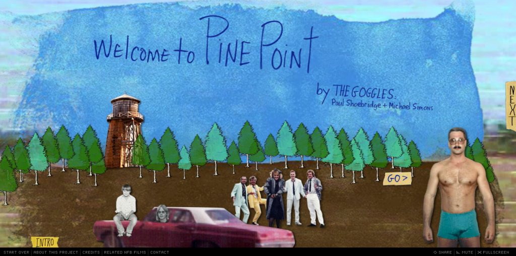
Analysis: Welcome to Pine Point, Pt 1

The interactive documentary, Welcome to Pine Point, was one of the first inspirations for my online documentary project/s. I love this 2011 project and its concept of creating an online “public photo album” that could serve “as a touchstone for people who lived there, but also, for those who didn’t.”

Screen Shot 2013-09-18 at 12.09.10 PM
My approach to analyzing the first three interactive documentaries (Snow Fall, Reframing Mexico, Flawed) doesn’t seem to work as well for this project; it doesn’t allow me to give enough detail. Welcome to Pine Point offers so many sources of inspiration for me, that I feel I must do a much closer (lengthier, detailed) analysis of its elements and content. So, I’m breaking this analysis up into two parts. In part one, I’ll provide an overview of the interactive documentary. In part two, I’ll provide a more detailed account of features that I’d like to use or that are particularly inspiring for me in my own project.

Design Elements Overview

  • flash-based, must reload every time you click on site
  • hosted on NFB of Canada site with links for site on top navigation bar and links for specific project on bottom navigation bar
  • project nav bar includes: Start Over, About this Project, Credits, Related NFB Films
  • combines animation, still photographs, old video, new video, text, music

Content

  • account by creators of their experiences at Pine Point + reflections on remembering and place
  • background video of Pine Point
  • old footage from Pine Point in the ’80s
  • chapters: Intro, Town, Pine Pointers, Ends and Odds, Cosmos 954, Here to Work, Shelf Life, What’s Weird, Remains, One for the Road,
  • slideshows + images of memorabilia + yearbook shots (tons of historical content!)
  • interviews with Pine Pointers

Responsive?

No

Storytelling

  • creative weaving together of various stories: history of town and its demise + history of individual Pine Pointers + history of era (80s) + history of storytellers (who have only limited connection with Pine Point: outsider?)
  • immersive: with soundtrack and background footage + memorabilia
  • provides multiple layers of information, enables user to view/read/craft their own story about Pine Point

Interactivity

  • click through different chapters at own pace (click arrows to go forward–next and backward–previous).
  • click on slideshows, with multiple images and footage, or skip them and move on
  • click on icons in introduction for text

Strengths

  • very well done weaving of creator’s personal perspectives in with the stories from Pine Point
  • nice balance between documenting history, sharing material and reflection on place and memory
  • creative visuals, especially use of background footage with old footage + audio interviews
  • love the incorporation of so much archival material that user can choose to access (or not)

Weaknesses

  • flash-based
  • not responsive
  • must reload every time and for every chapter
  • navigation: no way to pick a chapter, must click through entire story, one page at a time correction: I just figured out how to pull up the chapters, so my critique is wrong here. But, my overall impression that you are strongly encouraged to page through, from beginning to end, still seems accurate, especially after reading some interviews with the creators.

Things to Use?

see next post

Why this project?

As I think through the nature and purpose of this project (specifically as it relates to interactivity), I’ve been thinking again about why I’m doing it in the first place. I’ve talked about how this project is largely motivated by my efforts to not forget one of my most important home spaces. The process of culling through archival material and re-watching hours of footage enables me to reconnect and to rethink my relationship to the farm and its generations of inhabitants. It also allows me to reflect on my relationship with my current family (my sisters and my dad). But, that’s not the only reason I’m doing this project. When STA and I started working on our farm films over 12 years ago, we shot a lot of footage and gathered a lot of materials. For years, this footage gathered dust in a box, marked “farm stuff.” I didn’t want that to be how it ended up. I wanted to find a way to share the footage with others, especially family members who might not otherwise have access to it. I also wanted to share with those whom I don’t know, but who can connect with the experiences of having and losing a home space.

Why Interactive?

At this point in my process, I’m tentatively identifying my project as an interactive documentary. Will I continue to label it as such? Not sure. For now, I want to use the question, Why Interactive?, as an invitation (or demand) to constantly reflect on what interaction means to me and how it fits into my own methods for telling/sharing/collaborating on stories with others.

Recently, I was talking with STA about storytelling and documentaries. He doesn’t like interactive documentaries because he sees the interactive features as often tacked on and unnecessary and, as he  bluntly put it,  “in documentaries someone is telling a story, and they should tell it, not make me do it!” His reasoning got me thinking.

superficial and superfluous

I did a little research on how “interactivity,” “interactive documentary” and “interactive storytelling” gets used and came across the article, 20 Beautiful examples of “Snowfall” style interactive storytelling. In it the author describes the interactive storytelling found in the recent NY Times story Snow Fall as a “technique for presenting longform writing online, by embellishing it with integrated multimedia elements, gorgeous photography, infographics and so on.” The key word here is embellish. To add to or enhance. But not necessarily to transform, to make more meaningful, or to allow users/readers to interact with on deeper levels.

In their critique of the “Snow Fall” phenomenon, known as snowfalling, Bobbie Johnson suggests that these new multimedia techniques are just about “razzle-dazzle,” often distracting the reader from the story instead of inviting them to pay attention to and remember it. Johnson’s critique is a caution against using new, trendy techniques that compromise the integrity of the longform story. The focus, Johnson argues, should always be on the story and the reader who wants to deeply engage with it.

I like this idea of thinking about how to focus audiences on engaging with and paying attention to the story, not the flashy graphics or dazzling parallax techniques. But, in my thinking about the dangers of superficial interactivity, I want to take a slightly different approach. My different approach is partly because I don’t envision my interactive documentary as journalism, which seems to be the focus of these articles and the discussion of longform stories.

While Johnson is invested in longform stories and how new multimedia techniques may or may not distract/detract from their ability to communicate a compelling story, I’m interested in exploring how multimedia techniques might enable us to transform how we tell stories. What new forms of storytelling might come out of our experiments with digital (and visual, aural) storytelling? Besides long form stories, how can we tell stories that enable users to think deeply, to engage, to care about, and to participate in the ideas and experiences we are sharing? And how can we use new media to do so?

I see interactive storytelling and interactive documentaries as superficial and superfluous when they tell the same (bad/boring?) story, just with video or pretty images. Like here.  When they don’t challenge, resist, transform or play with linear methods that offer only a beginning, middle and end and that involve author-as-producer and user-as-passive-consumer.

busting the binary: production/consumption

Unlike STA, who wants a documentary to tell him a story, not invite him to participate in the crafting of that story, I like the idea of storytelling not as reporting or telling, but as collaborating and initiating a conversation with a wide range of others. I want users to engage with, pay attention to and participate in the process of making meaning out of the stories that I tell and the accounts that I give.  This interest in collaboration, conversations and in challenging the binary of author/artist-as-producer and user-as-consumer/listener, is heavily influenced by my training in feminist pedagogy and my investment in making and staying trouble. I’ll say more about those influences in a future post. 

in summary (for me):

  • interactivity is used to try telling stories in new, non-linear ways
  • interactivity is used to challenge/disrupt/play with the strict division between Storyteller and story listeners
  • interactivity is about encouraging users to engage, participate, pay attention, care, resist, interrupt stories