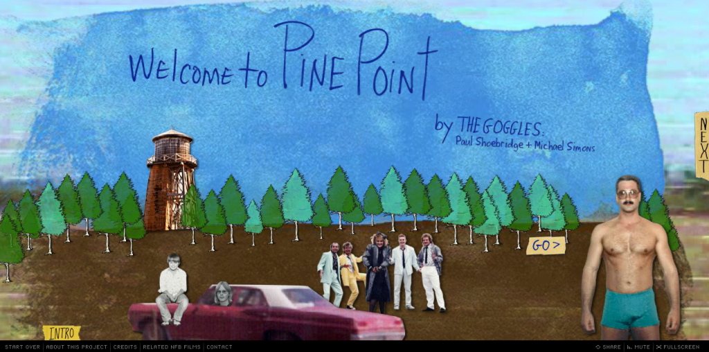
The interactive documentary, Welcome to Pine Point, was one of the first inspirations for my online documentary project/s. I love this 2011 project and its concept of creating an online “public photo album” that could serve “as a touchstone for people who lived there, but also, for those who didn’t.”

My approach to analyzing the first three interactive documentaries (Snow Fall, Reframing Mexico, Flawed) doesn’t seem to work as well for this project; it doesn’t allow me to give enough detail. Welcome to Pine Point offers so many sources of inspiration for me, that I feel I must do a much closer (lengthier, detailed) analysis of its elements and content. So, I’m breaking this analysis up into two parts. In part one, I’ll provide an overview of the interactive documentary. In part two, I’ll provide a more detailed account of features that I’d like to use or that are particularly inspiring for me in my own project.
Design Elements Overview
- flash-based, must reload every time you click on site
- hosted on NFB of Canada site with links for site on top navigation bar and links for specific project on bottom navigation bar
- project nav bar includes: Start Over, About this Project, Credits, Related NFB Films
- combines animation, still photographs, old video, new video, text, music
Content
- account by creators of their experiences at Pine Point + reflections on remembering and place
- background video of Pine Point
- old footage from Pine Point in the ’80s
- chapters: Intro, Town, Pine Pointers, Ends and Odds, Cosmos 954, Here to Work, Shelf Life, What’s Weird, Remains, One for the Road,
- slideshows + images of memorabilia + yearbook shots (tons of historical content!)
- interviews with Pine Pointers
Responsive?
No
Storytelling
- creative weaving together of various stories: history of town and its demise + history of individual Pine Pointers + history of era (80s) + history of storytellers (who have only limited connection with Pine Point: outsider?)
- immersive: with soundtrack and background footage + memorabilia
- provides multiple layers of information, enables user to view/read/craft their own story about Pine Point
Interactivity
- click through different chapters at own pace (click arrows to go forward–next and backward–previous).
- click on slideshows, with multiple images and footage, or skip them and move on
- click on icons in introduction for text
Strengths
- very well done weaving of creator’s personal perspectives in with the stories from Pine Point
- nice balance between documenting history, sharing material and reflection on place and memory
- creative visuals, especially use of background footage with old footage + audio interviews
- love the incorporation of so much archival material that user can choose to access (or not)
Weaknesses
- flash-based
- not responsive
- must reload every time and for every chapter
- navigation: no way to pick a chapter, must click through entire story, one page at a time correction: I just figured out how to pull up the chapters, so my critique is wrong here. But, my overall impression that you are strongly encouraged to page through, from beginning to end, still seems accurate, especially after reading some interviews with the creators.
Things to Use?
see next post