Last winter, Short of the Week redesigned their site. I came across it this morning. Pretty cool. Here’s something that they posted about the new design: Welcome to the New Short of the Week!
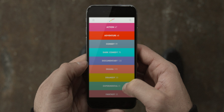
I really like how it looks and functions, both on a laptop and the iPhone:
I especially like that when you pause the movie, a brief description of the film and a link to a longer description pops up. And I like the horizontal strips. Are these stripes better than a grid for videos? Not sure. They seem a bit trendy and are pretty big on the screen. I think I’ll show this site to STA and get his opinion.

